Kunsthaus Graz
1. The architect is Peter Cook
2. It was built in 2003
3. This architecture is located in Graz, Austria
4. This architect is open to public as a museum.
5. It took 50 million dollars per square foot.
6. The purpose and meaning behind the building was based on the concepts of the Berliner architects realities and was different from very many buildings.
7. I picked this building because of the shape. I think that the shape of this building was vey different from anything I have ever seen. I also like the lights on the architecture. I think that this draws a lot of attention which caught my eye. The is my favorite because not only is the building a piece of art but it is a museum.

Nord LB building
1. The person that built this building is Gunther and Stefan Behnisch
2. It was built in 1970
3. It is located in Hanover, Germany
4. It is open to the public
5. It cost 181 billion euros
6. This building was built to be a high end bank and was meant for many businesses and meetings
7. I picked the building because of the all glass windows. I think this is a very cool piece of architecture because of how there are all glass windows and that is all someone can see which looks very neat. I slide like the shape because it looks like a bunch of buildings stacked onto each other. I think this was cool for me to see because it looks very cool on how the building was finished and stacked.

The UFO House
1. The architect was Matti Suuronen
2. It was starting the construction in 1978
3. The Ufo houses are located in New Taipei City, Taiwan
4. These houses were torn down in 2009 and now it is a hotel in its place.
5. These Ufo houses cost around 200,000 dollars
6. These buildings were built to be houses and hotels
7. I liked this picture because I have never seen anything like this before. I think that this is very cool because of the shape and they are sticking out on top of each other. I think that these ufo houses also look like they could be in outer space which adds a very cool touch. These houses also look like they are floating on top of each other which adds a cool dimension and effect.

Sculptured House
1. The architect is Charles Deaton
2. 1963
3. This architect house is located in Jefferson county, USA
4. This is a home
5. This home cost around 4.86 million
6. This building was meant to be a home
7.I liked this photograph of the architecture because I like how the house is almost on stilts. I like how the house is on stilts because I think that is adds a good level and lines up to the main part of architecture. I think that the shape of the home is very cool and designed very well leading out to the boucony on the edge. I also like how there are mountains in the background of this photo to show that this house is on a mountain.

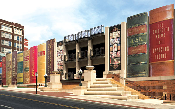
Kansas City Public Library
1.There is no architect found for the building of the library
2. This building was built in 1897
3.Located in Kansas City, USA
4. This is a public library
5.200,000 dollars
6.This building was meant to be a library and was actually the new model of the original building.
7. I think that this is an interesting picture because of the large books outside the building. I think that the large books around the building show case that the library is very nice. I think that this is a clever idea and that many people are drawn to go into the library and make people want to read. I think this was a very intelligent way for the architect to build it s many people will want to see it and it draws peoples eye to the building.


 lighting(through window)


 \\
\\


