1. The man that was killed by the subway was trying to stop a man from harassing and he got pushed in front of an oncoming train. The old man was not able to get up fast enough before the train came. The photographer was able to take the picture because he was trying to use his camera flash to warn the trains operator because he could not help Han himself but he just captured a picture while doing so.
2. The photographer took the photo trying to capture the moment because he was trying to save the mans life by waving his camera light in front of the operator to see if he would notice but was not able to get a hold of him before the train hit Han.
3. I think that the photographer should have taken the photo because he couldn't help Han himself and was trying to help him with his camera light so I think it didn't hurt that he took a photo for evidence of what went down on the subway.
4. I think that the photographer did the best thing he could have done because he would have been hit and killed by a train if he tried to help Han. I think that he did the best thing he could by not just sitting there and watching it but trying to get a hold of the operator by using his camera light.
5. I do and do not agree with the decision to put the photo on the front page of the New York Post because I think it shows a tragic event in memory of Han and also shows that this man did what he could to help but I also think that this photo does not need to be on the cover of the New York Post because it is a personal kind of story and this should just be between the almost hero and the victims family.
6. I think that the most important thing to a photojournalist is trying to stop bad things as it happens because it is more of a heroic move and you can take a picture along with the pride of knowing you helped or tried to help someone. I also think it is important for a photojournalist to capture life as it is happening to create emotion and art through their photographs.
7. I think that it is not ethically acceptable to involve himself or herself in a photo that they take because I think that the photographer should just captions he emotion or the story of the people which can come across in the photograph rather than trying to be a part of the picture or being in it. I only think it is acceptable if it is natural and does not interrupt what the picture could mean.
8. I think that photojournalists should not always avoid influencing events as they happen because it would not be very natural if they did. I think that the most beautiful thing about a photograph is if its natural and shows emotion and feeling.
9. I think that after reading all of the professional photographers responses the thing that stands out to me the most and that is the most appropriate for a photographer in this situation is the quote where they talk about how they should not post that picture for all of the family of the man to see. I think this is the best quote because they do prove a point that it is very sad to see a man about to die but it is especially sad for his family.
Tuesday, December 20, 2016
Tuesday, December 13, 2016
Study Guide Finals
Rule of Thirds: Rule of thirds is when the main subject is off to the side or not in the center of the picture but you can tell that that object or person is the main thing/subject.
Balancing elements: Balancing elements is when there is equal balance on each side of the photograph so it does not look unproportional.
Leading Lines: Leading lines are where the main object has lines almost leading to it or there are different lines and patterns because of lines throughout the photograph.
Symmetry and patterns: Symmetry is when each side of the picture or the opposite of the other side of the picture has the same design in the same place.
Viewpoint: Viewpoint is the view or angle that the picture is coming across as taken.
Background: Background is the back of the picture that looks almost in the distance. Background can also be simple to make sure that the main point has come across to the person looking at the photo.
Create depth: For depth in the pictures that is where there are different levels to make the picture look 3D.
Framing: Framing is where the picture is outlined by objects or the main focus point is outlined by objects.
Cropping: Cropping is where you make the picture smaller to show only what needs to be shown to get the message across.
Mergers and avoiding them: Mergers are objects that get in the way of pictures that you want to take and it confuses the person looking at the picture.
For photoshop the ethics of manipulating photos in photo shop are that it is not okay to change a picture drastically like change the appearance of the body of the person by making them skinnier or making their features change. What I do think is acceptable when changing a photo with photoshop is changing to make their face brighter or taking off a pimple.
Thursday, December 1, 2016
Tuesday, November 29, 2016
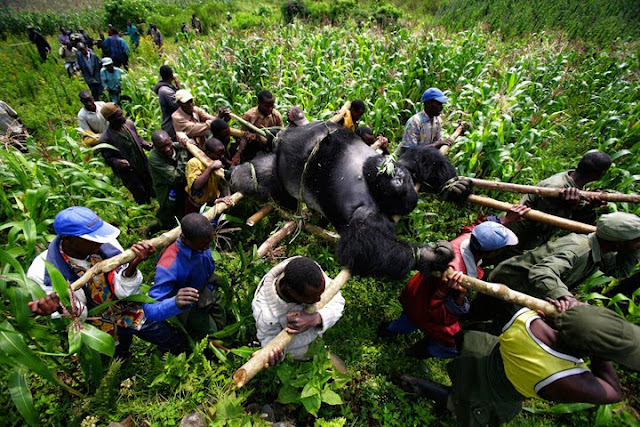
Gorilla In The Congo
1. This picture caught my eye and looked interesting because I liked how the picture is very brightly colored. I also like this picture because the gorilla is so large and a group of men are working together to carry the gorilla. I love how you can see the gorilla very clearly.
2. The SilverBack Gorilla was weighed in at around 500 pounds. It took tons of men to carry the gorilla. This picture was taken for a conservation and these people are actually helping the wildlife. This gorilla was shot dead previously.
3. What I learned in the additional pictures is how the conservation group has helped out Virunga National Park and all that they have done to help gorillas.
4.
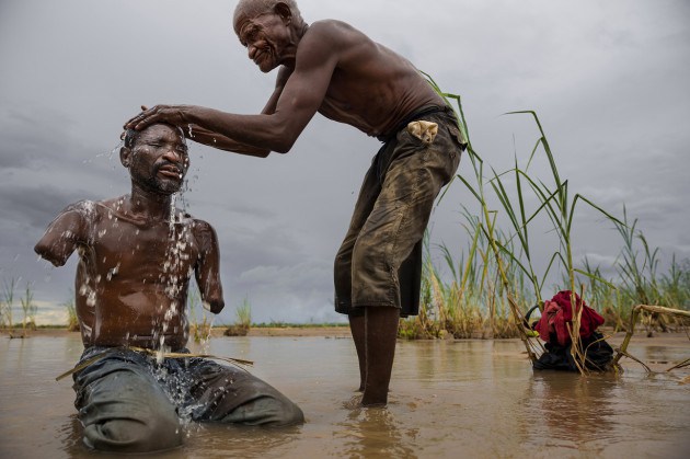
5. Name: Brent Stirton
Born : 1969 Durban South Africa
Education: it does not show where or if Brent Stilton went to college
2. The SilverBack Gorilla was weighed in at around 500 pounds. It took tons of men to carry the gorilla. This picture was taken for a conservation and these people are actually helping the wildlife. This gorilla was shot dead previously.
3. What I learned in the additional pictures is how the conservation group has helped out Virunga National Park and all that they have done to help gorillas.
4.


5. Name: Brent Stirton
Born : 1969 Durban South Africa
Education: it does not show where or if Brent Stilton went to college
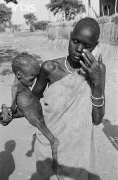
Starving Child and Vulture
1. I picked this image and this image caught my eye because it is very sad to see a starving child and this photographer took a picture that captured the emotion. Also, the fact that a vulture is in it makes it show more emotion and the land surrounding is very flat and dry and the child looks very poor.
2. In South Africa Kevin Carter decided to capture pictures to get across to people about how poor this part of Africa is. He came across to this toddler weeping because he couldn't make his way to the feeding center. He then saw a vulture that was very plump watched the vulture go away, and made sure the child made it to the feeding center.
3.
4. Name: Kevin Carter
Born and died: 1960-1994
Born: Johannesburg, South Africa
Education: University of Florida
2. In South Africa Kevin Carter decided to capture pictures to get across to people about how poor this part of Africa is. He came across to this toddler weeping because he couldn't make his way to the feeding center. He then saw a vulture that was very plump watched the vulture go away, and made sure the child made it to the feeding center.
3.


4. Name: Kevin Carter
Born and died: 1960-1994
Born: Johannesburg, South Africa
Education: University of Florida
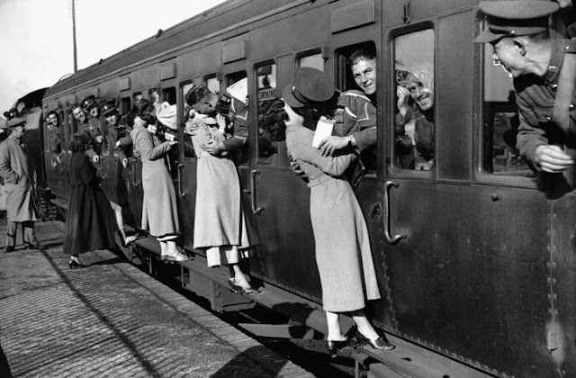
V- J Days In Time Square
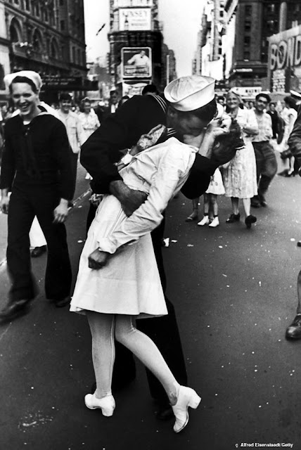
1. I picked this image and this image caught my eye because there is a beautiful background of NY and there is a man who just came back from war. Another thing that caught my eye about this photograph is that the man and the woman are both very happy that the war ended and they are what seems to be excited to see each other.
2. Alfred Eisenstaedt was one of the first four photographers hired at LIFE magazine. His mission was to find and capture an amazing storytelling moment. This picture was takenwhen WWII ended and they are purely happy and overjoyed that the war is over.
3. From the extra information and pictures it showed how popular this picture was. It was on many magazines and it was a way to celebrate the WWII ending. Also, what I did not know is that the people are not married and aren't even in love. They are just purely happy to be back from war.
4.
5. Name: Alfred Eisenstaedt,
Born and Died: 1898-1995
Born:Tczew Poland
Education: Humboldt university of Berlin
2. Alfred Eisenstaedt was one of the first four photographers hired at LIFE magazine. His mission was to find and capture an amazing storytelling moment. This picture was takenwhen WWII ended and they are purely happy and overjoyed that the war is over.
3. From the extra information and pictures it showed how popular this picture was. It was on many magazines and it was a way to celebrate the WWII ending. Also, what I did not know is that the people are not married and aren't even in love. They are just purely happy to be back from war.
4.


5. Name: Alfred Eisenstaedt,
Born and Died: 1898-1995
Born:Tczew Poland
Education: Humboldt university of Berlin
Milk Drop Coronet
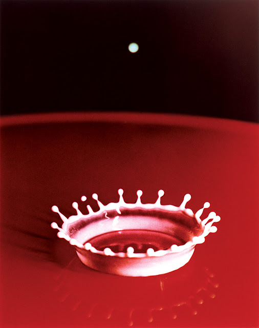
1. I picked this image because it is very different and it is not a person but an object. This also caught my eye because it is red when it says it is milk and the focus of the camera of the droplets of the milk look very cool with the bottle cap looking droplet or dropping into the milk.
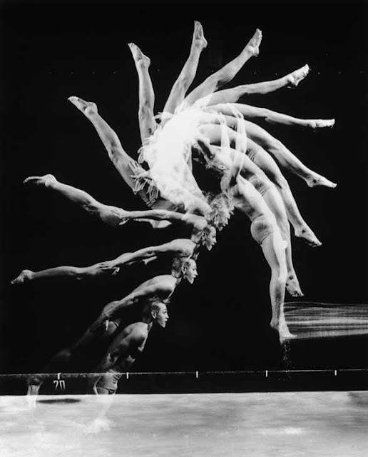
2. Harold Egerton took this picture with a timer and a camera of his own invention. Milk Drop Coronet is now his invention because the camera can stop the picture in motion. many of Egertons photos are taken in black and white and he focused for many years on the perfection of the Milk Drop Coronet.
3. In the additional information I learned about how it took Egerton 6 or 7 years to perfect. This video talked about Egerton's determination to perfect the Milk Drop Coronet.
4.
5. Name: Harold Egerton
Born and died: 1903-1990
Born: Fremont ,NE
Education: University of Nebraska–Lincoln, Massachusetts Institute of Technology
2. Harold Egerton took this picture with a timer and a camera of his own invention. Milk Drop Coronet is now his invention because the camera can stop the picture in motion. many of Egertons photos are taken in black and white and he focused for many years on the perfection of the Milk Drop Coronet.
3. In the additional information I learned about how it took Egerton 6 or 7 years to perfect. This video talked about Egerton's determination to perfect the Milk Drop Coronet.
4.


5. Name: Harold Egerton
Born and died: 1903-1990
Born: Fremont ,NE
Education: University of Nebraska–Lincoln, Massachusetts Institute of Technology
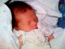
First Cell-Phone Picture
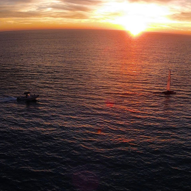
1. I picked this image because I love babies and I saw that this was the first ever picture taken on a cell phone. It caught my eye because surrounded by all of the violence I saw a baby and I thought it was sweet that this was the first ever picture taken on a cell phone.
2. A man named Philipe Kahn was in a maternity ward and his wife gave birth to their daughter. He wanted to send a photo to his friends and family of their daughter as soon as possible so he tinkered with technology and came up with a way to connect his camera with his i phone to send a picture of their newborn baby,
3.
4.
Name: Philipe Kahn
Born: March 12, 1952
From: Paris, France
School: ETH Zurich
2. A man named Philipe Kahn was in a maternity ward and his wife gave birth to their daughter. He wanted to send a photo to his friends and family of their daughter as soon as possible so he tinkered with technology and came up with a way to connect his camera with his i phone to send a picture of their newborn baby,
3.


4.
Name: Philipe Kahn
Born: March 12, 1952
From: Paris, France
School: ETH Zurich
Thursday, November 17, 2016
Tuesday, November 15, 2016
Fashion Photography
First Video: In the video the changes that are made throughout the video are her neck was made longer, her hair was fixed to flow better, her eyes were made bigger and moved up, the tones and lighting of her skin were also changed, they made her eyebrows darker, defined her cheekbones, raised the eyebrows, they made her skin and neck look thinner, shrunk her ear, and defined her nose, also made her skin reflect the light and defined nose.
Second Video: In the video the changes that were made throughout the video are that they fixed any of the women imperfections and redness on her face. Then made here eyes bigger which made them go upward, they fixed her lips to look more plump, they made her nose and nostrils smaller, they made her skin look more tan and her shoulders more skinny and upward, they made her thinner and her boobs not droop as much, they made her legs longer and her feet more defined and shorter, and they made her legs more tone and tan, they also made her neck longer, and all of her body more defined, and her skin lighter and her hair more tame and perfect, they made her butt closer to her body and made her skin reflect the light.
Third Video: In the video the changes that were made were that they shrunk the butt and thighs of the woman, made her skin all over look tight and shrunk her arm flab, they made her boobs more upright and lifting as well as larger, they shrunk her back and her skin on her back,they made her waist smaller, they cut off some of her arm to look more thin and all of the skin tight, then later in the video they shrunk her chest size to fit the changes that the photoshop had done to her body, they changed her elbows to look more pointy and thin, they changed the size of her head, they made her butt more perky, they made her hair longer, they also made her face look more narrow, and her hair fuller, they changed the woman fingers to become more thin, they also changed the brightness and levels and made her skin tome match the brightness changes.
Questions:
1. I do not think it is ethically acceptable to change a person's appearance like they did in these videos because the readers are not even looking at real people and they think that it is only okay to have skinny, thin people as models. Everyone should be happy with who they are and not have to worry about their weight.
2. I think that the circumstances where changing someone to become thinner and smaller are more ethically wrong because it is a person's weight which is worse than changing a person's skin. I also think that when a person does not even look like what the editor changed the person to be is also wrong to do where a quick fluff of the hair etc. is more right.
3. Some changes that are ok are when taking off a pimple or fixing the brightness of the person's face as well as maybe making their hair more fluffed. I do not think it is okay when a person is being changed to be made smaller and thinner. I think that the skin tone can also be changed but whenever it is so dramatic that the person does not even look like a person or you don't even recognize them then it is take a little too far.
4. I think the differences between fashion photography and photojournalism is fashion photography is mostly changing someone dramatically. They do this to make someone and change them to be made thinner and such. In photojournalism is mostly changing the lighting of the background of the face lighting as well as adding in a blue, green, or red tone.
5. When Fashion Photography is compared to reality the person does not even look like what they started as and the pictures that are taken and edited are not very realistic. However, in photojournalism the pictures are very realistic because no major changes are made to the person or the background. These affect the ethical practice because fashion photography is not ethical because so much is changed while photojournalism is ethical because not much is changed.
6. I think that Mr. Reeves is showing us that photoshop can do dramatic and shaking changes to a person or even changing a object into a different object or person. Also, that this is morally unethical because it is not good to change a person this much. Also, to show the difference between photojournalism and fashion photography and that in photojournalism not much is changed to a person.
7. None of these videos are about guys I think because women who are reading this are more focused on the way people's body looks as well as their own. I also think this because a lot of women in newspapers and magazines have very little clothing on.
Friday, November 11, 2016
10 Best Cities For Street Photography... In The World
Link: http://www.lightstalking.com/best-cities-street-photography/
This article showed emotional cities to take pictures. This article also describes how the cities are like a playground for photographers. I learned that there are many places to take pictures in the city because you can show the emotion that is displayed on the people and their activities such as what they are doing, eating, etc. This is somewhat of a tutorial and I can use these tips in class if we have a prompt shoot and then I can go downtown and take photos of the prompts through the city of Austin with emotions and such. This is a tutorial because the article describes how to take pictures and tips and good places to take pictures in different cities. However, this did not talk about the programs name. This article relates to photography because the city is a great place to take pictures when being a photographer because like I said before there are many emotions and things that you can capture.
This article showed emotional cities to take pictures. This article also describes how the cities are like a playground for photographers. I learned that there are many places to take pictures in the city because you can show the emotion that is displayed on the people and their activities such as what they are doing, eating, etc. This is somewhat of a tutorial and I can use these tips in class if we have a prompt shoot and then I can go downtown and take photos of the prompts through the city of Austin with emotions and such. This is a tutorial because the article describes how to take pictures and tips and good places to take pictures in different cities. However, this did not talk about the programs name. This article relates to photography because the city is a great place to take pictures when being a photographer because like I said before there are many emotions and things that you can capture.
What makes a killer time-lapse, with Joe Capra
Link: http://blog.ted.com/how-to-create-a-killer-timelapse-with-joe-capra/
The things that this time lapse shows is of the ocean and cars and people and sunsets and sunrises. The Tom Lowe talks about his time lapse video. He says that time lapses blew him away while looking at it one night and he wanted to do it himself. The video is of Rio. Lowe said that it took him a long time to figure out editing and how long he should keep the clips for and how many clips he got. Lowe says most shots take 29-30 minutes but some shots take even more. I learned that a time lapse video requires full commitment to go and take the shots as well as editing the clips and putting them together. Tom Lowe is a filmmaker as well as a writer who lives in California but once finding out about time lapse he started to take a deep interest and commit himself to it.
The Oldest Living Things In The World
Link: http://www.rachelsussman.com/oltw/
The things that the article talks about is the oldest things in the world. The things that the article says are describing how the person who captures the photograph has a deep connection and it took a while for them to get the perfect picture. The photographer has taken photos regarding science and environmental things. Something that I learned from the small article and the pictures were that some photographs of things are very rare and there is an art of how to get the right distance and the right landscape.
a. I picked this picture because first of all it is 2,000 years old, second the branches all lean in a certain was that is beautiful. There are wrinkles in the tree which are very cool and that is showing that the tree is old and has been standing for a long time.
b. The rules of photography that I see in this picture are lines because there are so many little branches as well as big and the little veins that are running through the base of the reel which resemble lines.
c. The photographer that took this photograph is Rachel Sussman.

projector Brought Into the Forest Turns Nature Into a Glowing Wonderland
Link: http://petapixel.com/2015/01/01/projector-brought-forest-turns-nature-glowing-wonderland/
The article about a projector that turns the nature into a glowing wonderland shows how they made nature look like a wonderland and made everything look very realistic from just a projector. There are many pictures that show how the projector effected, plants, animals, and even a spider web. I learned that you could make real life things such as nature and turn them into a bright and colorful place from a projector.

a. I picked this picture to be my favorite because the sky and background is black and the spider is a normal color but the spider web is a bright glowing color that looks really cool and pretty with the background being black.
b. The rules of photography that I see in the picture are rule of thirds because the spider web is more to the right side rather than in the middle. This picture also shows the rule of simplicity because the background is so plain and the colors are nothing but black and different shades of blue.
c. The person that took this picture is Friedrich Vanschoor.
The article about a projector that turns the nature into a glowing wonderland shows how they made nature look like a wonderland and made everything look very realistic from just a projector. There are many pictures that show how the projector effected, plants, animals, and even a spider web. I learned that you could make real life things such as nature and turn them into a bright and colorful place from a projector.
a. I picked this picture to be my favorite because the sky and background is black and the spider is a normal color but the spider web is a bright glowing color that looks really cool and pretty with the background being black.
b. The rules of photography that I see in the picture are rule of thirds because the spider web is more to the right side rather than in the middle. This picture also shows the rule of simplicity because the background is so plain and the colors are nothing but black and different shades of blue.
c. The person that took this picture is Friedrich Vanschoor.
6 Types of Photos Every Photographer Should Know How To Take
Link: http://petapixel.com/2014/12/01/6-types-photos-know-make/
On this website I learned different rules and tips of how to take good pictures that every photographer should know how to make. The picture angles, perspective, landscape or portrait can determine how much more interesting the picture can be. From this website I learned how to make a polar panorama picture as well as how to angle the camera to make cool effects that catch someones eye. The same picture that you could have taken can be changed to be made even more interesting with a new perspective or just by simply changing the angle from portrait to landscape. This relates to photography because the tips that are given are all how to change the picture to make it better. This is somewhat of a tutorial and I could use this in class by changing the angle of the picture or taking an overhead panorama picture. Photoshop's Photomerge is a software and a way to stitch and blend frames together in a panorama picture.
On this website I learned different rules and tips of how to take good pictures that every photographer should know how to make. The picture angles, perspective, landscape or portrait can determine how much more interesting the picture can be. From this website I learned how to make a polar panorama picture as well as how to angle the camera to make cool effects that catch someones eye. The same picture that you could have taken can be changed to be made even more interesting with a new perspective or just by simply changing the angle from portrait to landscape. This relates to photography because the tips that are given are all how to change the picture to make it better. This is somewhat of a tutorial and I could use this in class by changing the angle of the picture or taking an overhead panorama picture. Photoshop's Photomerge is a software and a way to stitch and blend frames together in a panorama picture.
10 Photography Resolutions for the New Year
Link: http://petapixel.com/2014/12/31/10-photography-resolutions-new-year/
On this New Years resolution website I looked at resolutions for photography for the new year. There is a list of a few things that photographers should do to put themselves and their photos out there. The description also went along with a picture for each tip or resolution. Some things I learned from this article was to share personal experiences through photography and not be afraid to post or get critiqued. Every person has gotten criticized and it makes them better. This site related to photography because the resolutions for the new year can make you a better photographer. The tips are all surrounded by your confidence with the pictures that you post and share as well as photoshop and the gear that you use.
On this New Years resolution website I looked at resolutions for photography for the new year. There is a list of a few things that photographers should do to put themselves and their photos out there. The description also went along with a picture for each tip or resolution. Some things I learned from this article was to share personal experiences through photography and not be afraid to post or get critiqued. Every person has gotten criticized and it makes them better. This site related to photography because the resolutions for the new year can make you a better photographer. The tips are all surrounded by your confidence with the pictures that you post and share as well as photoshop and the gear that you use.
Tuesday, November 8, 2016
Magazines Part 2
Image:
This the of magazine cover is the most common type of cover design. Most of the time there are people looking at the camera and smiling. Some also have a picture of a person with a grumpy face for example. Not all pictures are of happy people and they are not always looking at each other but for the most part there are people on the cover.
Illustration:
Drawn illustrations were the only way of creating magazine overs in the mid 30s of the 20th century. Many of the illustrations on magazines now are made to be funny or out of the ordinary. There are many places that get computer generated illustrations as well. Many magazines do not want illustrated covers but the ones that do have illustrated covers are very eye catching.
Type:
This approach of cover is rare for magazines. There is always something very powerful about the way the numbers and words are arranged. Type based covers are very shocking as well as striking and not many people print type based magazines anymore and only a few have come out in the past few years.
Concept:
Concept based magazine covers are used to get across a strong message and to make a point. In a funny shaking way. When planning a concept magazine cover you need to be thinking even if you understand it you need to think if the readers will understand the message you are trying to get across. This type pf cover is rare as well.
The relationship between words and photos on a magazine cover is words can be witty and you can give all of the information on the front cover from words and numbers and arrange with color and photos are more of trying to get the message across from a picture of a action of a facial expression. This is important because some topics cannot come across from a picture so you need to have words and numbers while some topics can come through from a picture and explain everything and catch the readers eye. But both pictures and words need to catch the readers eye.
My Favorite Cover
FAVORITE:
Finalist
The New York Times Magazine, May 19, The Secret Lives of Germs
Photographer: Hannah Whitaker
Designer: Arem Duplessis
"This cover story by Michael Pollen argues that while we have been obsessed with eradicating germs, there are health advantages to being exposed to them. The cover shot by Hannah Whitaker of a baby being licked by a dog makes graphic the prevalence of germs in our everyday lives."
Critique:
My favorite cover of all of the ones I saw was the baby with the dog licking the baby's face. I think that this picture fits the title because the title is germs and the dog is licking the baby's face which is giving off germs. And this is a cute funny picture to draw the reader to want to read more and want to find out more about germs. The lighting is prefect and the background is very simple which is good for this cover because it makes it clear what the center focus is and what the writers or the ones who created the cover are trying to get across. One thing that I would change about this cover is move the title a little bit down because the title as well as the faces of the dog and baby are all clumped together in the center.
Best Covers
1. Formal
2. Formal
3. Informal
4. Environmental
5. Informal
6. Formal
7. Formal
8. Formal
9. Formal
10. Formal
11. Formal
12. Formal
13. Formal
14. Informal
15. Formal
16. Informal
17. Formal
2. Formal
3. Informal
4. Environmental
5. Informal
6. Formal
7. Formal
8. Formal
9. Formal
10. Formal
11. Formal
12. Formal
13. Formal
14. Informal
15. Formal
16. Informal
17. Formal
Magazine Tips
5 things I should think about when designing my magazine cover:
1. Color and making sure everything goes together and relates to the main theme and title.
2. Logos and the font and size as well as the creativity of the name.
3. Simplicity of the cover with the pictures and making sure everything is not too cluttered.
4. Making sure that I have a lot of coverlines.
5. Framing of the cover and pictures on the cover.
Thursday, November 3, 2016
Portraits and Self Portraits Preview - Planning
Best Tips:
Shoot Candidly- Sometimes posed shots can look somewhat...posed. Some people don't look good in a posed environment and so switching to a candid type approach can work. Photograph your subject at work, with family or doing something that they love. This will put them more at ease and you can end up getting some special shots with them reacting naturally to the situation that they are in. You might even want to grab a longer zoom lens to take you out of their immediate zone and get really paparazzi with them. I can find that this can particularly work when photographing children.
Movement- Portraits can be so static- but what if you added some movement into them? This can be achieved in a few ways:
- by making your subject move
- by keeping your subject still but having an element in the scene around them move
- by moving your camera (or it's lens to achieve a zoom burst)
The key with the above three methods is to use a slow enough shutter speed to capture the movement. The alternative is to have your subject obviously move fast but to use a shutter speed so fast that is 'freezes' their movement.
Alter your Perspective- Most portraits are taken with the camera at (or around) the eye level of the subject. While this is good common sense- completely changing the angle that you shoot from can give your portrait a real WOW factor. Get up as high and shoot down on your subject or get as close to the ground as you can shoot up. Either way you'll be seeing your subject from an angle that is bound to create interest.
Environmental Portraits:
I like this picture and I chose this picture because the woman looks like she is enjoying what she is doing and is genuinely happy doing yoga and in nature.
I like this picture because of the lighting in the picture and the background and I like how this picture is not staged and how the person is in the middle of an action or motion.
Photography Self Portrait:
I like this picture and I chose this picture because the woman is taking the picture herself but is looking out at the background through a car windshield which I really like.
I like this picture and I chose this picture because the woman is being creative with her photography skills and using a prop which are the dandelions.
Casual portraits
I like this casual portrait and I chose this one because I really like the background of the colored wood. And the woman is off to the side in a very casual stance and casual outfit.
I like this casual portrait because she is just laying down in a bed of flowers in a cute casual dress with a camera.
Paragraph:
For my portrait assignment I was thinking of shooting my sister who is 5. I think a picture of her with a flower background would be cute for her age. I will also probably dress her in a somewhat causal outfit so the picture does not looked staged. I think that with a fancy outfit the picture will not look natural and the emotion will not come out through the picture. I will make the picture look crisp and "boho" by the background and outfit of my sister. I will make her hair wavy or straight with flowers and a small smile to make it look again, very natural and casual. NOT STAGED.
Tuesday, November 1, 2016
American Soldier
A. I think the most powerful picture printed in the Denver Post is the one called, A Mothers Wish. I think that this picture is the most powerful out of all of the pictures because Ian is getting baptized and accepting Jesus christ into his life. This even took place on his mothers birthday and his mother said,"I feel like he has a little extra in his pocket to watch over him." Ian was also baptized before he was going to be deployed so this was especially very meaningful to his mother.
B. I think the images throughout the Denver Post work together to show a story because it shows Ian from the beginning wanting to be in the army and then it shows when he goes off to training, says goodbye to his parents. This also shows when Ian is growing up being deployed, baptized etc. This is showing how Ian is growing up and all that he went through to become who he wants to be.
C. The captions enhance the photographs in Denver Post because without the captions the story is still shown but more emotion and feeling comes through from the picture when you know what Ian and his family thinks and says.
D. The story from the captions starts when Ian Fisher is guaranteed a spot on the years enlisting. Ian graduates from school and then before he is about to leave he goes to the recruiting office to talk to the people to expect the kind of things that Ian will be doing while there. Ian has parties with his families and friends and then says goodby and leaves for training. On the first day of training Ian hurts his elbow. Ian then goes through training and gets his rifle badge. Ian then picked out an engagement ring while he was with his girlfriend and then proposed on christmas. Ian then went through more and more injuries but then finally recovered and got baptized on his mothers birthday. Then, he got deployed soon after to Iraq. Ian after coming back was then deployed again and after he came back he got married to his girlfriend.
E. In the photos the pictures and captions for the majority are written in present tense.
F.
1. The captions are around 2 to 3 sentences on average.
2. For the first sentence the captions normally give a who, what, when, where and why.
3. For the second sentence they give more detail about where they are and sometimes a quote.
4. The third sentence, if there is a third sentence normally explains extra detail or finishing a quote of what the person (Ian) thinks.
5. A lot of the captions in this Denver Post provide a quote to show the feeling and emotion of the photos that were captured.
6. There are some captions throughout the newspaper that have four sentences but that is only if multiple people have a quote or there is a lot of information to be shown.
G. I think it is possible to tell a complete story with photos and captions because a picture can capture so much emotion and the caption can get people to really understand all of the emotion that is trying to be displayed.
H. Even though you can create a story with photos and captions I think it is important to also write stories because sometimes you have to create a story to a picture and be creative and sometimes you need a lot of explanation to what is happening in the story.
Friday, October 28, 2016
Composition Rules Part 2
Thursday, October 27, 2016
Funny Captions

Eddy and Angus(the dog) at their home in Oklahoma this beautiful Saturday afternoon once Eddy fell playing basketball with his son he landed by his dog, Angus. Eddy just turned 97 two days ago and he is enjoying every minute of it falling down while trying to remember the good old days and having long talks with his dog.

Bert, a single man is in downtown Austin dancing for joy that he is still alive Today on his 90th birthday. Bert is quoted when he said, "your never too old to get some ladies" as he danced through the night with joy.

Hazel, while grocery shopping in northern Utah on this amazing Sunday afternoon wore this shirt so people would stop bothering her while she was trying to pick out good food. It took a long time for me to get Hazel to smile because as her shirt said, "I HATE EVERYONE."
Tuesday, October 25, 2016
Warm-Up
1. As I worked my through these images at the beginning of the pictures I saw the happiness and the joy of the life that they lived and as i scrolled through the pictures they became more sad. The woman began to lose her hair and lose her smile and then slowly looked like it took a toll on her life. Whenever it showed the empty bed and the grave that made me even more sad because it captured her life when she was happy until her death.
2. After reading the quote that the photographer stated, "These photographers not define us, but they are us." I thought after the photographer said this means that her cancer didn't have a say on their love or relationship and this wasn't their whole life and all the conversations and things that they have ever done and said.
3. I do not think I could shoot photos that good if I were in that situation because I would feel too upset to take pictures of the ones that I love who are suffering and I would only want pictures of the person healthy and happy and not to remember the bad way it ended.
4. If I could write Angelo a letter I would tell him that I am sorry for his loss and would ask him how he could capture a moment or time period like that when it was very hard for him to go through it in person.
Tuesday, October 18, 2016
Abandones Theme Parks
The theme park I would want to go to is Chippewa Lake Park in Medina County, Ohio. I would like to go to this theme park because there are many roles coasters and things that were there. But, a while after the theme park was abandoned the forest behind and surrounding the park covered all of the roller coasters and the park became part of the forest which I think would be cool to capture. I think this would be interesting to capture because the lighting of all of the plants would be very cool to capture when really it is a theme park.

1. The Grand Hotel - Kupari, Croatia.
2. The lock bridge
3. Danube River
4. Letters to Juliet Wall
5. in the Bay of Bengal underwater

I think it would be very fun to document this location of the lock bridge in Paris, France. I think it would be cool because there are so many names and things on the locks and all of the locks are different colors and shapes on a metal fence. I think there are so many different angles and ways that you could capture pictures on this bridge. Also, following many of the rules of photography.
I would need money for round trip flight, money for meals and hotel as well as a DSLR camera. I would just be able to walk to the bridge and take photos.

1. The Grand Hotel - Kupari, Croatia.
2. The lock bridge
3. Danube River
4. Letters to Juliet Wall
5. in the Bay of Bengal underwater

I think it would be very fun to document this location of the lock bridge in Paris, France. I think it would be cool because there are so many names and things on the locks and all of the locks are different colors and shapes on a metal fence. I think there are so many different angles and ways that you could capture pictures on this bridge. Also, following many of the rules of photography.
I would need money for round trip flight, money for meals and hotel as well as a DSLR camera. I would just be able to walk to the bridge and take photos.
Africa
I was sad to hear that Nick Brandt went through and saw all of the animals 13 years earlier and went through and there were so many animals. Then when he went back he saw zero. That is sad to me. Also, he would wait up to 18 days to get a picture of the animals which is amazing to me because it shows he is very dedicated with his work.

I like this picture because it shows how the elephant is the center with a plain background the the rest of the background is manly elephants.
The rules of photography that are evident in this picture are rule of thirds because even though the elephant is off centered the main focused elephant is to the right. This also shows simplicity because it is just a plain backdrop with the elephants so it gets across the main point. This also shows lines because the elephants are following in a line.
The kind of camera that Nick Brandt used was the Pentax 6711 with only two fixed lenses. The reason for him to take these photos was to show that animals have a personality and a soul so he gets close to capture that. Also, He is also trying to help so the animals can be preserved and not hunted.
Nick Brandt Quote:

Thursday, October 6, 2016
Great Black and White Photographers part 3
1.
What first caught my eye about looking at my photographers pictures is that some were simple and one thing in the picture made it pop and others were crammed with things that made sense to be in that picture.
A. For example in this picture that was taken by Dorothea Lange, the photograph shows a ton of things going on in the picture but it all makes sense. Some photographs do not look good with many things in it but this picture really well shows how a lot in the picture catches your eye. The wooden building caught my eye in the background of the picture.
B. In this photograph taken by Margaret Bourke, I like how simplicity is shown. The "barrels" are all that is focused on and this is what caught my eye because there is not too much but at the same time not too little.
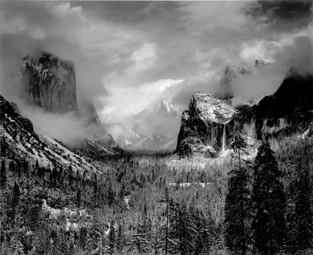
C. In this photograph taken by Ansel Adams, what caught my eye about this picture is the fog in the air. This caught my eye because the fog is covering some of the mountains almost and I fell like everything else is the background.
Great Black and White photographers part 2 :5 senses.
Key:
A. I see....
B. I smell....
C. I hear....
D. I taste....
E. I feel....
1.
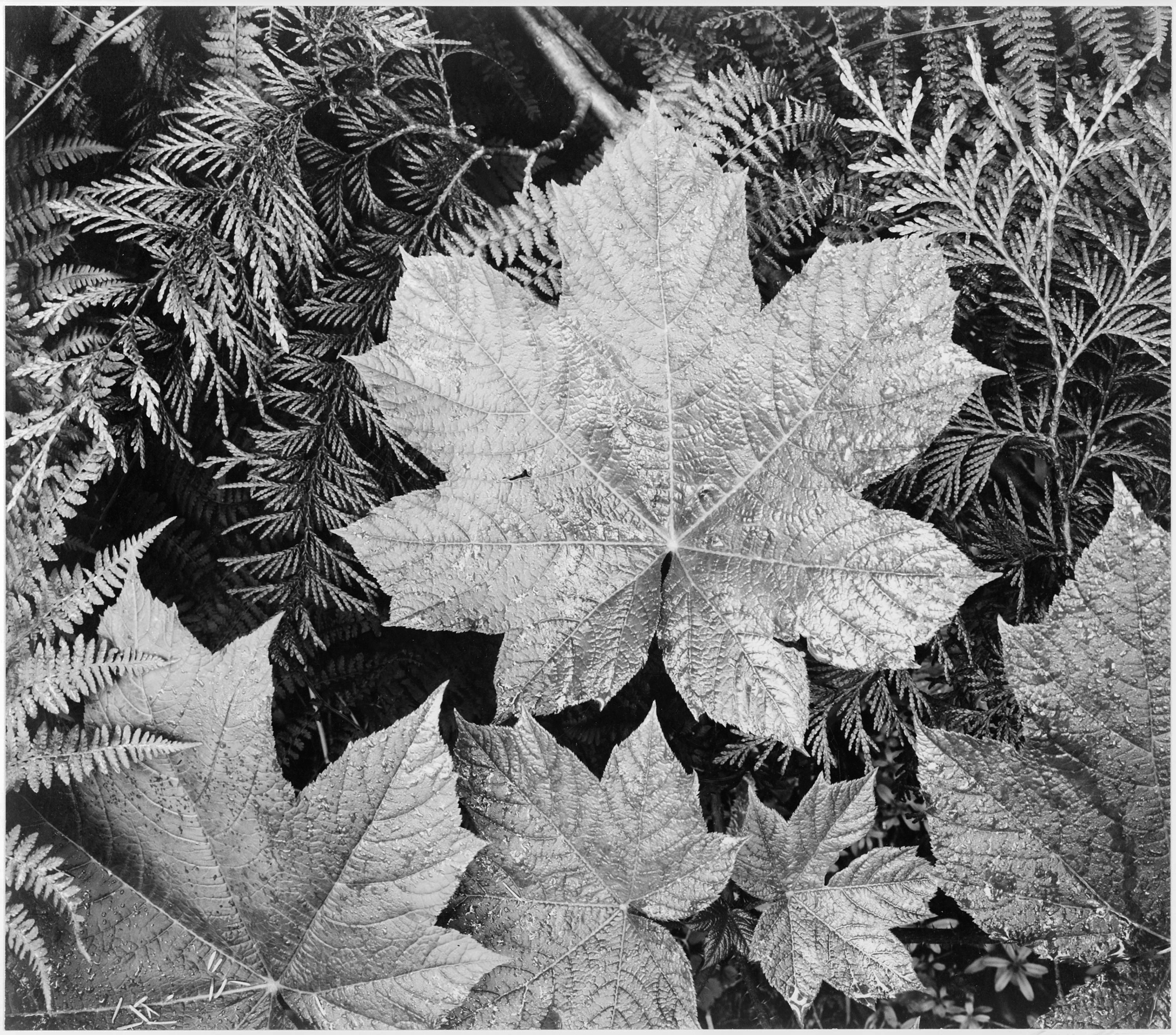
A. I see the veins in the leaf. The veins run through the leaves of the branches and connect to the tree. I see the little thorns on the branches behind the leaves.
B. I smell the forest that the leaves of the tree live in. I smell the pine tree from a mile away. I also smell the fresh breeze that has been blown on the leaves.
C. I hear the rustling of the leaves as they rub together in the wind. I hear the deer running underneath the tree. I hear the rustle of the birds nearby making a nest in the tree.
D. I taste the cool crisp air that rests on the leaves. I taste the fuzziness of the leaves. I taste the dew that dropped from the leaf from the morning.
E. I feel the fuzzy and prickliness of the leaves and thorny branches. I feel the sharp pieces of grass sticking up into my sandals. I feel the strap of my camera hanging around my neck while I am trying to get a good picture.
2.

A. I see the valleys and the peaks of the mountains. I see the empty patches of the mountain where snow doesn't lay. I see the clouds overhead looking as though it is about to rain.
B. I smell the frostiness of the snow. I smell the clouds as it is about to rain. I smell the dirt underneath the snow of the mountain.
C. I hear the wind blowing against the snow on the top of the mountain. I hear the rustling of the snow rolling down the side of the mountain. I hear the hikers start their climb up the mountain.
D. I taste the crystalized snow that melts in your mouth. I taste the sweat from hiking up to the mountain. I taste the cool air as it blows into my mouth.
E. I feel the fuzzy crisp snow on top of the hard rocky mountain. I feel my fingers press on the camera button. I feel the roughness of there rock that is covered in snow.
3. Something I would like to create to show the world I am a great photographer is another blog of just my pictures. I would like this so I just have my pictures on the blog as well as show people the pictures I have created. And what I would like to create to show the class my thoughts and feelings about my favorite photographer is a power point because you can put pictures in and audio if that person had a interview.
Subscribe to:
Comments (Atom)


